

The theme of my End of Study Project was “Design System”, and I had the choice of the singular project I would work on. I had wanted for a long time to do a redesign of an old video game, and this was the opportunity to try using my knowledge of Design Systems on a more practical and innovative use case.I selected Empire Earth II because I knew that it was a game that was criticized on its lack of usability, and that its complex design was a good example of which kind of products could benefit from a Design System.
Here is how I approached this redesign:
- User Reseach : Testing the game with Usability testing, defining the target through Personas and identifying the experience issues with an Eperience Map.
- UX Design : Solving the problem through Information Architecture and identifying which systems needed to be improved through UI.
- UI Systems : Designing Atoms through Components, designing the UI System and laying out the documentation to use the Design System.
- Final Experience : Mockups and Prototype build based on the Design System
<a class="mainbutton" href="https://politessier.webflow.io/project/empireearth-ui">Access UI Systems and Final Experience</a>
After some initial secondary research, I gathered some players that had either previously played Empire Earth II or were RealTime Strategy Gamers. I devised a Usability Study with several testing means: a qualitative survey, a perception test, a gameplay session followed by a self-assessment review. This allowed me to gather high quality data that reflected the issues that each player went through their experience with Empire Earth, as well as their own expectations and habits when playing strategy games.

The qualitative survey was enough for me to build a primary persona of my test players. This helped me crystalize some traits about the core audience of the game : they don’t care for tutorials, mainly play on PC, and like to experiment with the game’s rules.

A lot of pain points were raised in the test, including building classification, icon clarity, unexplained mechanics, but I chose to focus on one of the main loops of gameplay that was left misunderstood: buying technologies and advancing to a new epoch. Creating this experience map helped identifying exactly where the misunderstandings were happening, along with which information were not explained properly or straight up lacking.

The original design of Empire Earth II included a whole deal of actions accessible from the main menu, as its goal was to let the player access most actions in a glance. This leads to a very crowded sitemap and the main problem of this architecture is the lack of connection between mechanics, especially regarding buildings and their effects. One of the feedbacks I acquired from players was how lacking were the menus detailing links between technologies and buildings producing technology points. I worked on the epoch advancement user path (in blue here) to link technology selection to technology buildings.

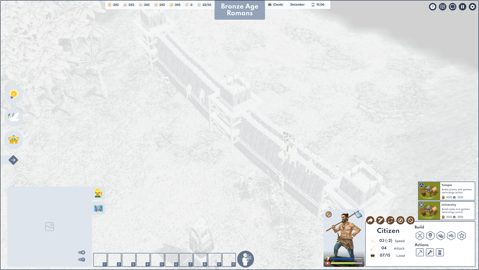
To lighten the load on the main HUD, I skimmed through which informations are directly accessible to the player, and trying to keep only what they would need. This was also done through turning the Technology, Diplomacy and Crown menus to a vertical navigation panel that opens up a modal window, in order to let the player focus towards only one complex decision at a time.
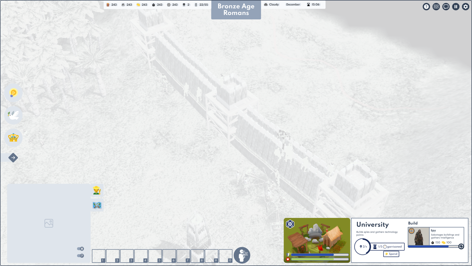
Unit and building panels are made available contextually depending on the player’s selection. Details on production are available in the building panel along with some information to describe their utility.


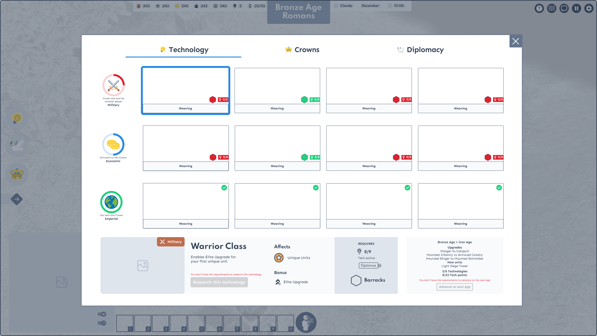
The modal detailing technologies takes up most of the screen to direct the player's focus to one decision at a time. The state of each technology has been made clear and there is a visual link between technologies and advancing an epoch, as well as a contextual button when the requirements are met.

<a class="mainbutton" href="https://politessier.webflow.io/project/empireearth-ui">Access UI Systems and Final Experience</a>